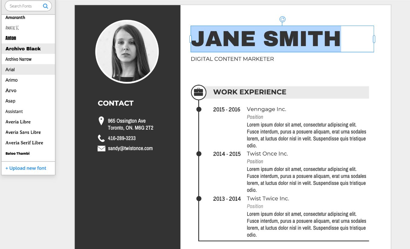
When crafting a resume, every detail matters. From the layout to the content, each element plays a crucial role in creating a positive impression on potential employers. One often overlooked but essential aspect of resume design is the choice of font. The right typeface can enhance readability, convey professionalism, and ensure your resume stands out in a stack of applications. This article explores the best fonts for resumes and offers tips on selecting the perfect one for your job application.

Why Font Choice Matters
Your resume is a representation of you. Just as you would dress appropriately for a job interview, your resume should be dressed in a font that is professional, easy to read, and appropriate for the industry. A well-chosen font can:
- Enhance Readability: A clear, legible font makes it easier for hiring managers to read and understand your qualifications.
- Convey Professionalism: Certain fonts have a professional appearance that can make your resume look more polished.
- Reflect Your Personality: While subtle, the style of your font can give a hint of your personality and suitability for the role.
Serif vs. Sans-Serif Fonts
Before diving into specific fonts, it’s essential to understand the difference between serif and sans-serif fonts:
- Serif Fonts: These fonts have small lines or embellishments (serifs) at the end of their letters. Examples include Times New Roman and Georgia. Serif fonts are often seen as traditional and are commonly used in print materials.
- Sans-Serif Fonts: These fonts do not have serifs, giving them a cleaner and more modern appearance. Examples include Arial and Calibri. Sans-serif fonts are typically easier to read on screens, which is important as many resumes are now viewed digitally.
Top Fonts for Resumes
Here are some of the best fonts for resumes, each with its unique advantages:
- Times New Roman
- Type: Serif
- Why It Works: A classic and traditional choice, Times New Roman is widely used and recognized for its professionalism. It’s a safe bet for any industry, especially those that are more conservative, like law and academia.
- Arial
- Type: Sans-Serif
- Why It Works: Arial is a clean, modern font that is easy to read on both digital and printed resume formats. It’s a versatile option that suits a variety of industries.
- Calibri
- Type: Sans-Serif
- Why It Works: As the default font for Microsoft Office, Calibri is familiar and comfortable for most readers. Its modern and straightforward appearance makes it a reliable choice.
- Georgia
- Type: Serif
- Why It Works: Georgia offers a blend of traditional serif elegance with superior readability on screens, making it ideal for both digital and printed resumes.
- Verdana
- Type: Sans-Serif
- Why It Works: Verdana is designed for readability at small sizes and on screens. Its wide spacing and large x-height make it one of the most legible fonts.
- Garamond
- Type: Serif
- Why It Works: Garamond is an elegant and classic font that can give your resume a sophisticated look. It’s an excellent choice for creative and artistic industries.
- Helvetica
- Type: Sans-Serif
- Why It Works: Helvetica is known for its clean and modern aesthetic. It’s a favorite in the design world and works well for tech and creative roles.
- Cambria
- Type: Serif
- Why It Works: Cambria is designed for readability and is a great option for longer resumes with more text. It’s professional yet approachable.
Tips for Choosing the Right Font
- Consider the Industry: Different industries have different expectations. For example, creative industries might appreciate a more unique font like Helvetica or Garamond, while more traditional fields might prefer Times New Roman or Georgia.
- Readability: Your resume should be easy to read at a glance. Avoid overly stylized or decorative fonts, as they can be distracting and hard to read.
- Consistency: Stick to one font throughout your resume. Mixing multiple fonts can make your document look cluttered and unprofessional.
- Font Size and Spacing: Typically, a font size of 10 to 12 points is recommended for the main text, with larger sizes for headings. Ensure there is enough spacing between lines and sections to avoid a cramped look.
- Print and Digital Compatibility: Ensure your chosen font looks good both on screen and in print. Print out a test copy of your resume to check how it looks on paper.
- Software Compatibility: Use standard fonts that are available across different platforms and devices. This ensures your resume looks the same no matter where it’s viewed.
The Psychology of Fonts
Fonts can subtly influence how your resume is perceived. Here’s a brief look at what different fonts might convey:
- Times New Roman: Professional, reliable, and traditional.
- Arial: Modern, straightforward, and clean.
- Calibri: Fresh, contemporary, and efficient.
- Georgia: Elegant, readable, and authoritative.
- Verdana: Clear, approachable, and friendly.
- Garamond: Artistic, sophisticated, and classic.
- Helvetica: Innovative, stylish, and minimalistic.
- Cambria: Formal, structured, and readable.
Avoid These Fonts
While choosing the right font is crucial, knowing which fonts to avoid is equally important:
- Comic Sans: Too informal and unprofessional.
- Courier: Mimics typewriter text and looks outdated.
- Papyrus: Overused and can appear amateurish.
- Impact: Too bold and difficult to read in large blocks of text.
Final Thoughts
Selecting the right font for your resume writing is more than just a design choice; it’s a strategic decision that can impact the first impression you make on potential employers. By choosing a font that enhances readability, conveys professionalism, and aligns with industry standards, you can ensure your resume stands out for all the right reasons.
Remember, your resume is a reflection of you. Just as you would tailor your resume content to the job you’re applying for, take the time to choose a font that presents your qualifications in the best possible light. With the right font, you’ll not only capture attention but also demonstrate your attention to detail and understanding of professional presentation.

