
 4.9
4.9 4.5
4.5MIT’s Career Advising office and Purdue OWL prescribe the same baseline cover letter structure: single-spaced, left-justified, 1-inch margins, 250 to 400 words. This guide gives you the exact settings for every element so your finished letter clears ATS filters and reads cleanly on a recruiter’s screen.
TL;DR: Single-space everything, use 1-inch margins on all sides, choose a 10–12 point professional font, left-justify the entire document, keep total length between 250 and 400 words, and save as PDF unless the application specifically asks for .docx.
Before You Start
You need a word processor (Google Docs, Microsoft Word, or LibreOffice Writer all work), the job posting open in another tab, and a copy of your resume for reference. Match your cover letter’s font to whatever you used on your resume so the two documents look like they belong together. The University of Michigan Career Center recommends using the same 10-to-12-point font across both documents, with margins between 0.5 and 1 inch.
Time required: 15 to 20 minutes if you already have a draft of your letter content. If you’re starting from scratch, add another 30 minutes for writing.
Skill level: nothing beyond basic word processing. If you can change a font size and adjust a margin, you’re set. If you want a broader overview of cover letter anatomy before you begin, our complete formatting guide covers the reasoning behind each element.
Step 1: Set Margins, Font, and Page Layout
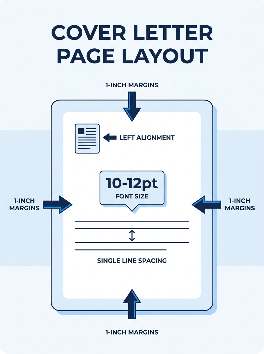
Open a blank document and set all four margins to 1 inch. This is the standard cited by Purdue OWL, Resume.io, and virtually every university career center. According to Resume.io’s US spacing guide, you can reduce margins to 0.75 inches if your letter runs long, but you should “never double-space a cover letter, as it reads as an academic essay and pushes the letter past one page.”
Set your font to one of these: Calibri, Arial, Garamond, Cambria, or Times New Roman. Size should be 10, 11, or 12 point. If you’re using Calibri or Arial (which run wider than serif fonts), 11 point is usually the right call. For Times New Roman or Garamond, 12 point works better.
Set alignment to left-justified. Do not use full justification (the setting that spaces words out to fill each line evenly), because it creates uneven word gaps that can confuse ATS parsers and look odd on screen. The University of Michigan Career Center specifies a “left justified” layout “beginning no more than 2 inches from the top.”
Set line spacing to single (1.0). And use one space after periods, which is the current typographic standard and produces more uniform line breaks than the old two-space convention.
You’ll know it worked when your document shows 1-inch margins on all sides, single-spaced text, and left-aligned formatting. Print preview should show plenty of white space around the edges without the text feeling cramped.
Step 2: Build Your Header and Recipient Block
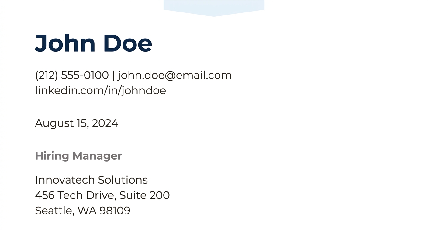
Start at the top of the page with your contact information. Stack these on separate lines, left-aligned:
- Your full name (bold or slightly larger font is fine here, but not required)
- Your street address (or city and state if you prefer to omit the full address)
- Your phone number
- Your email address
- Your LinkedIn URL (optional, but increasingly expected)
Leave one blank line after your contact block, then type the date in full format: September 29, 2026. Abbreviations like 9/29/26 look informal and can cause confusion in international contexts.
Leave another blank line, then add the recipient’s information:
- Hiring manager’s name (if you have it)
- Their title
- Company name
- Company address
Purdue OWL’s formatting tips are specific about this structure: “Leave a space between addresses and dates in the heading.” That single blank line between each block keeps the header scannable for both human readers and ATS software.
You’ll know it worked when your header has three distinct blocks (your info, the date, their info) with one blank line separating each.
Step 3: Write the Salutation
Leave one blank line after the recipient block and type your greeting. The strongest option uses the hiring manager’s name: “Dear Ms. Rodriguez:” or “Dear Dr. Chen:”. Use a colon after the name, not a comma. The colon is the standard for business correspondence in the US.
When you can’t find a name (and you’ve checked the company website, LinkedIn, and the job posting itself), use “Dear Hiring Manager:” as your fallback. Grammarly and Resume Genius both recommend “Dear Hiring Manager” or “Dear [Department Name] Hiring Team” as acceptable alternatives.
Avoid “To Whom It May Concern.” It reads as outdated and signals that you didn’t bother researching the company. And 47% of employers say they won’t consider candidates who show a lack of company knowledge, according to recruiter surveys. That stat should motivate you to spend 5 minutes on LinkedIn looking for the right name. A separate finding puts it in even sharper terms: 26% of hiring managers specifically notice when a candidate addresses them by name.
You’ll know it worked when your salutation addresses a specific person or uses “Dear Hiring Manager:” with a colon, not a comma.
Step 4: Format the Body Paragraphs
The body of your cover letter has three sections, and each one works as a single paragraph. MIT’s Career Advising and Professional Development office describes the structure this way: “State clearly in your opening sentence the purpose for your letter and a brief professional introduction.” The middle paragraph connects your experience to the role’s requirements. The closing paragraph includes a call to action.
Here are the formatting rules for the body:
- Single-space within each paragraph. No extra line spacing between sentences.
- Add one blank line between paragraphs. This replaces traditional indentation. Do not indent the first line of each paragraph. Left-justified, block-style formatting is the standard.
- Keep total length between 250 and 400 words. Resume.io’s ATS cover letter guide specifies this range. Letters under 200 words feel dismissive, while letters over 500 words rarely get read in full.
Each paragraph should run 3 to 5 sentences. If you find yourself writing 8-sentence paragraphs, you’re covering too much ground. Cut or split.
Tip: Seventy percent of employers prefer cover letters that are half a page or less. If your letter fills more than two-thirds of the page, edit for length before adjusting margins downward.
Personalization matters for formatting a cover letter that stands out. Reference the company name and the specific role title in your opening paragraph rather than writing a generic “I’m applying for a position at your company.” If you want to see how different templates handle this structure, the variation is mostly in header design and font choices; the body formatting stays constant across industries.
You’ll know it worked when your body has three distinct paragraphs separated by blank lines, no first-line indents, and the whole letter fits on one page with room for your signature block.
Step 5: Add the Closing and Signature
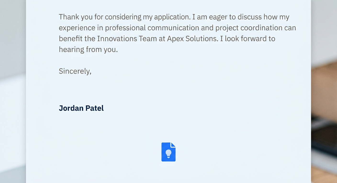
Leave one blank line after your final body paragraph, then type your complimentary close: “Sincerely,” or “Best regards,” followed by a comma. Either works for any industry. Avoid “Yours truly” (reads overly formal in most contexts) and “Thanks!” (too casual outside a startup email thread).
After the closing, leave three blank lines. Purdue OWL specifies “at least three spaces between your complimentary close and typed name.” This gap is where a handwritten signature goes on printed letters. For digital submissions, the blank space still looks polished and gives the document visual breathing room.
Type your full name below the three-line gap. Including your phone number or email again on the next line is optional since they’re already in your header.
The three-line gap between your closing and your typed name is one of the smallest details that separates a professional-looking letter from a rushed one.
You’ll know it worked when you see your closing line, a visible gap of roughly three blank lines, and your typed name beneath it.
Step 6: Save and Name the File
This is where many applicants lose points. Save your cover letter as a PDF unless the job posting explicitly asks for a .docx file. PDFs lock your formatting in place so the hiring manager sees exactly what you designed, regardless of their operating system or word processor. Resume.io recommends structuring your letter in “five clear sections” and saving “as a .docx or PDF before submitting.” In practice, PDF is the safer default for preserving layout.
Name the file with a clear, professional convention: FirstName_LastName_Cover_Letter.pdf. No spaces, no special characters, no version numbers like “v3_final_FINAL.” The filename shows up in the ATS dashboard and sometimes in the recruiter’s email notification, so it functions as a small but real branding moment.
You’ll know it worked when you open the saved PDF on a different device and the formatting looks identical to your original document.
When Formatting Breaks
Three problems come up repeatedly, and each has a fast fix.
The letter spills onto a second page. Don’t shrink the font below 10 point. Instead, cut your body content first. If you’ve already trimmed aggressively and the letter still runs over, reduce margins to 0.75 inches on all sides. Going below 0.5 inches makes the document feel cramped and can cause ATS parsing errors.
The PDF looks different from your Word document. This happens when your word processor substitutes a missing font during export. Before saving to PDF, confirm that your chosen font is actually installed on your machine. Google Docs handles this well because it uses web fonts, but desktop Word installations sometimes swap Calibri for a similar-but-not-identical typeface.
You pasted content and the formatting went haywire. When building your letter from pieces of old cover letters, always paste using “Paste without formatting” (Ctrl+Shift+V on Windows, Cmd+Shift+V on Mac), then reapply your font and size. Pasting formatted text drags in hidden styles that create inconsistent spacing and font sizes within the same document.
Our step-by-step format walkthrough covers additional edge cases like letters with enclosures or multiple-page reference lists.
Where to Go From Here
With formatting a cover letter handled, the structural skeleton is done. The content inside that structure is where real differentiation happens between you and every other qualified applicant.
If you want to see how different industries apply these same settings with different visual emphasis, browse through the cover letter format samples we’ve put together across five common scenarios. And if you’re submitting a resume alongside your letter, make sure its header, font, and margin settings match what you’ve built here. Consistency between the two documents signals attention to detail, which is exactly the kind of thing hiring managers remember when they’re narrowing a shortlist from 15 candidates to 5.
One final check before you send: open your PDF at 100% zoom and read it the way a recruiter would, top to bottom, in about 30 seconds. If anything looks off-center, crowded, or inconsistent between your header and body, you’ll catch it now. That last visual pass costs you a minute and saves you from the kind of first impression you can’t undo.