
 4.9
4.9 4.5
4.5Google Docs defaults to 1.15 line spacing and Calibri 11pt. Microsoft Word defaults to 1.08 spacing and the same font. Both produce cover letters that look cramped and parse poorly through applicant tracking systems. This tutorial resets each default to hiring-manager-approved values in 10 steps, taking about 15 minutes.
TL;DR: Set 1-inch margins, use a 10.5–12pt standard font, single-space your text, left-align everything, keep the whole document under 400 words, and save as PDF. These six decisions handle nearly all formatting for a cover letter that actually gets read.
Before You Start
You need a word processor (Google Docs, Microsoft Word, or LibreOffice Writer), the job posting open in a separate tab, and your resume nearby for reference. No design software. No premium templates. Total time commitment: 15–20 minutes if you follow each step in order.
One prerequisite most guides skip: read the job posting’s application instructions before you touch your document. Some employers explicitly request .docx files instead of PDFs. Some specify “no attachments” and want the letter pasted into an email body. 58% of employers reject applications with obvious formatting errors, according to industry hiring data, and ignoring a file-format instruction counts as one of those errors. Catch this before you format a single line, because the requirement changes your approach at Step 10.
Step 1: Set Margins to 1 Inch on All Sides
The goal is white space that looks professional without wasting page real estate. Purdue OWL’s formatting guide and every major career resource recommend 1-inch margins on all four sides. In Google Docs, go to File → Page Setup and type “1” into each margin field. In Word, go to Layout → Margins → Normal (which defaults to 1 inch).
You’ll know it worked when: the ruler at the top of your document shows the text area starting at the 1-inch mark. If your letter runs long later, you can tighten margins to 0.75 inches, but never go below that threshold because narrower margins make the page feel dense and harder to scan quickly.
Step 2: Choose a Standard Font at 10.5–12pt
ATS software parses standard fonts without errors. The safe choices: Arial, Calibri, Garamond, Cambria, and Times New Roman. According to Cover Letter Copilot’s 2026 analysis, the ideal body font size falls between 10.5pt and 12pt. Indeed’s career team recommends bumping your header name up to 14pt or 16pt for visual hierarchy while keeping body text within that 10.5–12pt window.
Select all text (Ctrl+A or Cmd+A), pick one font, and set the size. Don’t mix typefaces between sections. Use one font at one size for body text, and a larger size only for your name at the top.
You’ll know it worked when: the entire body reads in a single consistent typeface, and three paragraphs of text fit comfortably on one page with room to spare.
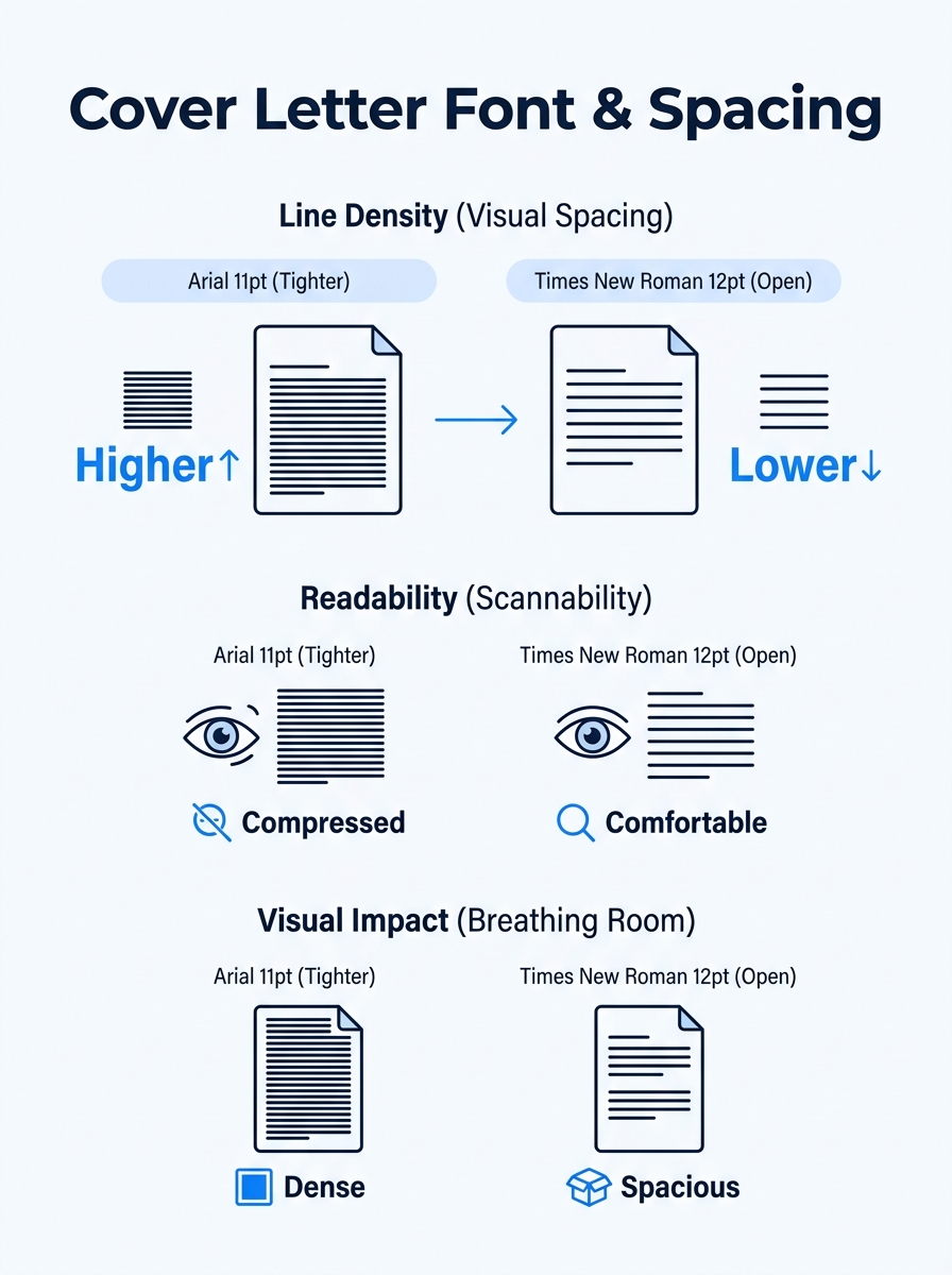
Step 3: Set Single Line Spacing with a Blank Line Between Paragraphs
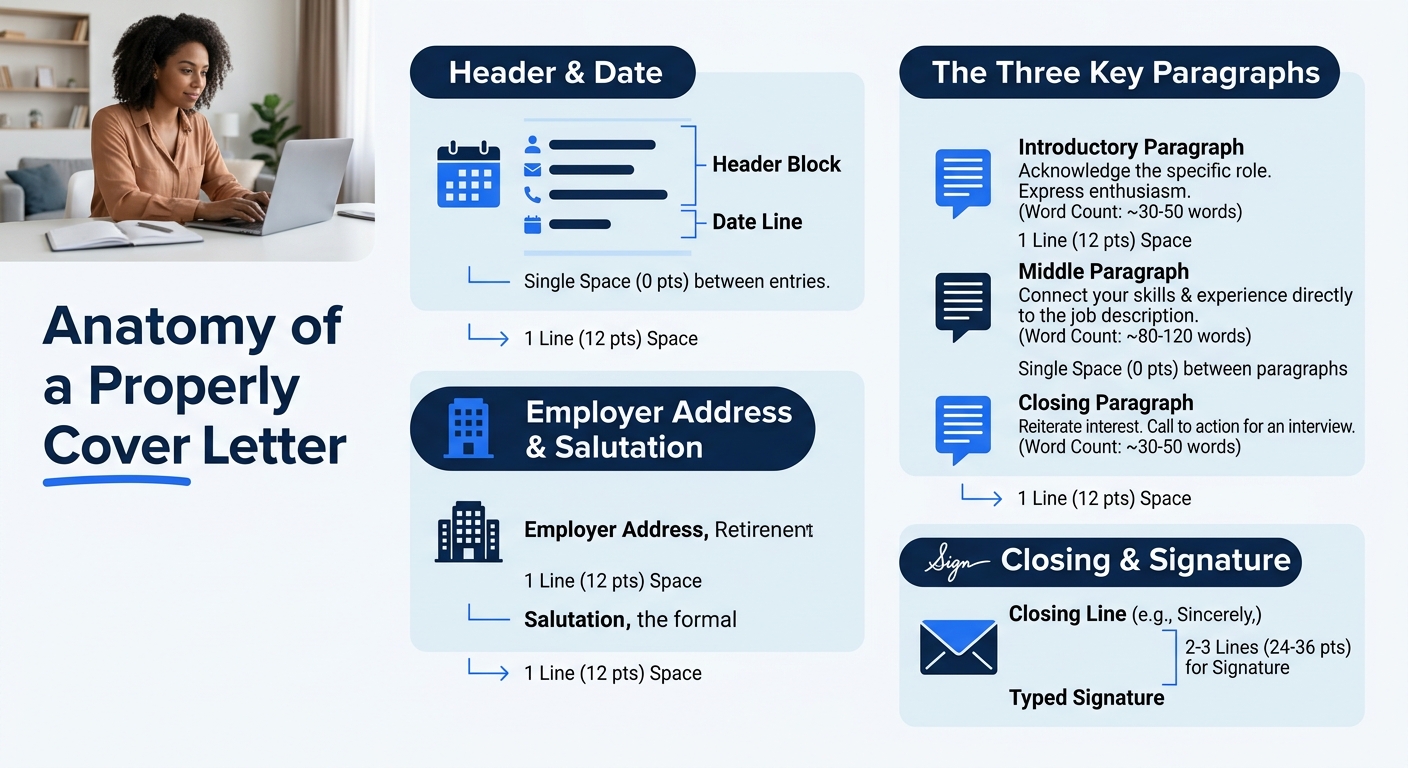
Single spacing within paragraphs. One blank line between them. Indeed’s formatting guide specifies this directly: “Single-space your text. Add a blank line between paragraphs and each major section (e.g., after the salutation, between body paragraphs, before the closing).” In Google Docs, go to Format → Line & Paragraph Spacing → Single. In Word, go to Home → Line Spacing → 1.0, then set “Before” and “After” paragraph spacing to 0pt.
That blank line between paragraphs replaces indentation. Don’t indent the first line of any paragraph. First-line indents belong in academic essays, not business correspondence.
You’ll know it worked when: your paragraphs sit in neat blocks with visible breathing room between them, and no first line is indented.
Step 4: Left-Align All Text
Full block format means every line starts at the left margin. No centered text (except, optionally, your name in the header). No justified alignment. Justified text creates uneven word spacing on shorter lines and can trip up older ATS parsers. The fix: select all text and hit the left-align button (Ctrl+L or Cmd+L).
If you’ve been working from a creative template with centered headings or right-aligned dates, this single step fixes the most common ATS parsing failures. Our step-by-step format guide walks through why left alignment matters for machine readability in more depth.
You’ll know it worked when: every line, from your address to your sign-off, begins flush with the left margin.
Step 5: Build Your Header Block in Plain Text
Your header contains your contact information. Place it at the very top of the document, inside the body text area. Do not use the word processor’s Header/Footer function. ATS software frequently skips content placed in those fields. Apply Mate’s ATS-friendly template guide confirms five core rules, the first being: “One column, standard font. Contact details in the body of the letter, never in a header or footer.”
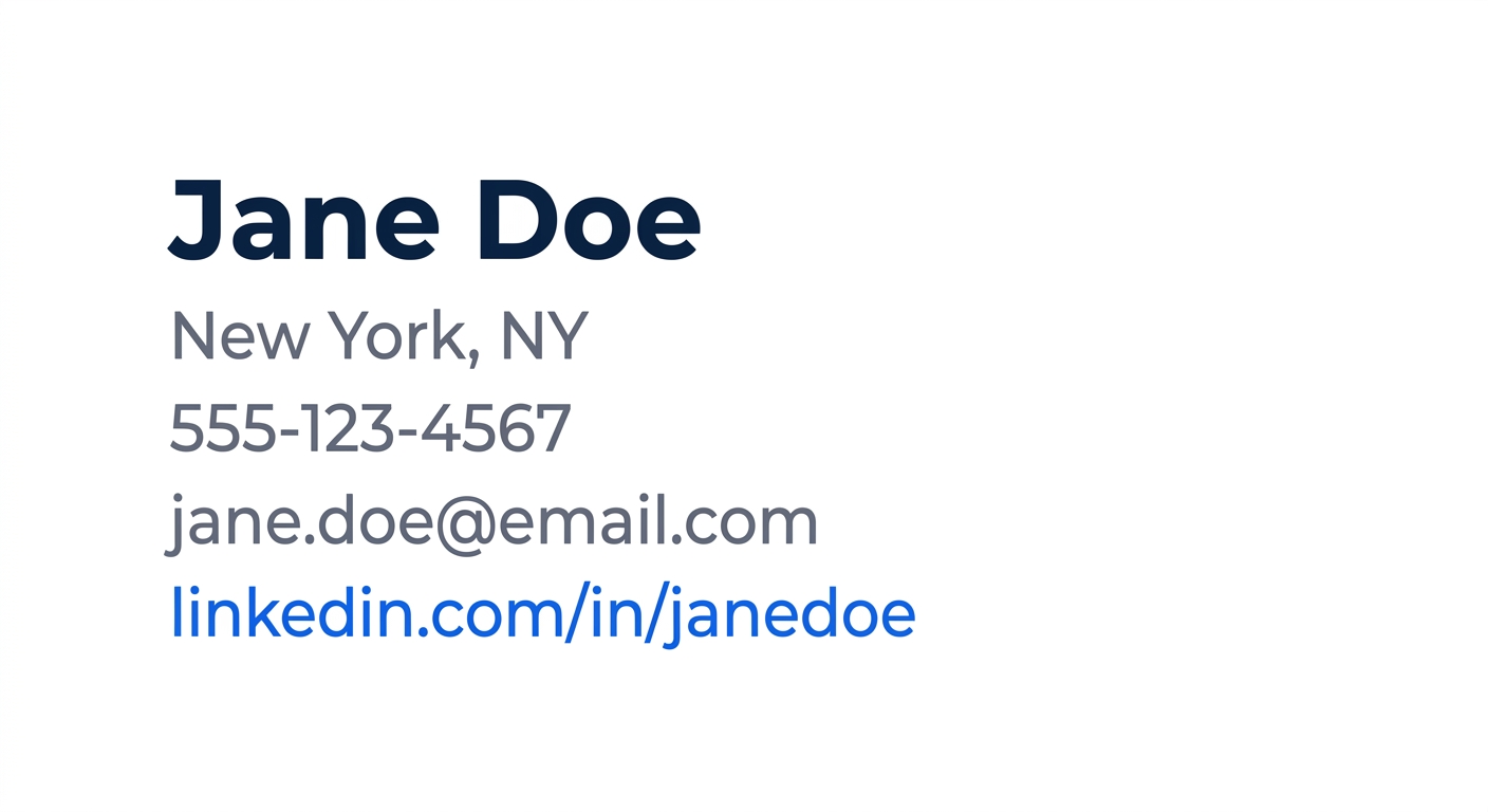
Format your header as plain text, each item on its own line:
- Your Full Name (14–16pt bold)
- City, State ZIP (full street address is optional)
- Phone Number
- Email Address
- LinkedIn URL (optional)
No tables, no columns, no text boxes. Plain lines of text.
You’ll know it worked when: you can click anywhere in your contact block and it behaves like normal editable text, not a floating element or table cell.
Step 6: Add the Date and Employer Address
Skip one blank line after your contact info. Type the full date (written as “September 30, 2026,” never “9/30/26”). Skip another blank line and add the hiring manager’s name, title, company name, and company address. If the posting doesn’t name a specific person, use the department name or “Hiring Committee.”
This employer address block matters most in formal industries like finance and law, where 83% of hiring managers say cover letter formatting influences their decisions. In tech and startup contexts, some applicants skip it. When you’re unsure, include it. No hiring manager has ever rejected a letter for being too formally addressed.
You’ll know it worked when: your letter has four distinct visual blocks at the top: your info, the date, their info, and then the salutation.
Step 7: Write Your Salutation
“Dear [Name]:” with a colon is the standard. “Dear Hiring Manager:” works when you lack a specific name. Skip “To Whom It May Concern.” Research shows 47% of employers will pass on candidates who demonstrate no knowledge of the company, and a fully generic salutation signals exactly that kind of indifference.
Skip one blank line after the salutation before your first body paragraph.
Step 8: Structure Your Body in 2–4 Paragraphs, 250–400 Words
Here’s where formatting for a cover letter intersects with content. Resume.io’s ATS guide specifies 250–400 words across three or four paragraphs as the target. Broader hiring data aligns: 70% of employers prefer cover letters that run half a page or less. Going over 400 words pushes you toward a second page and signals you can’t edit yourself.
Here’s a practical breakdown of paragraph roles:
- Paragraph 1 (2–3 sentences): Name the role you’re applying for and one specific reason you’re a strong fit.
- Paragraph 2 (3–5 sentences): Your most relevant achievement or experience, with numbers where possible.
- Paragraph 3 (2–3 sentences, optional): A second point or a company-specific observation that shows research.
- Paragraph 4 (1–2 sentences): Thank them and express interest in a conversation.
If you need guidance on what to actually write inside these paragraphs, our cover letter formatting guide covers the content strategy in detail.
Tip: Count your words before moving on. In Google Docs, select just the body text (salutation through sign-off) and check Tools → Word Count. Over 400 words? Cut your weakest paragraph. Under 200? You look like you didn’t try.
Step 9: Close and Sign Off
“Best regards,” or “Sincerely,” followed by one blank line, then your typed full name. Purdue OWL notes you should sign your name in ink between the close and typed name for printed letters. For digital submissions, the typed name alone works fine.
Don’t experiment here. “Warmly,” “Cheers,” and “With enthusiasm,” all carry risk depending on the reader’s expectations. “Best regards” and “Sincerely” are universally safe across every industry. Use the 2 seconds you save on this decision to proofread one more time instead.
Step 10: Save as PDF (With One Exception)
PDF locks your formatting so it renders identically on every screen, every operating system, every device. Enhancv’s ATS guide confirms that PDF and DOCX are the two accepted file types for applicant tracking systems. Default to PDF unless the application portal or job posting explicitly asks for .docx.
In Google Docs: File → Download → PDF Document. In Word: File → Save As, then choose PDF from the format dropdown.
You’ll know it worked when: you open the PDF on your phone or a different computer and every margin, font, and spacing decision looks exactly the way you set it. If anything shifts, you saved the wrong format.
The goal of cover letter formatting is invisibility. When the document disappears, the argument for why you deserve the job comes through.
When Things Break
Your letter spills onto a second page. The most common culprit is leftover paragraph spacing from your word processor’s default template. Verify that line spacing is 1.0 (not 1.15 or 1.5) and that “Before” and “After” paragraph spacing are both 0pt. Still too long? Tighten margins to 0.75 inches or cut body text down to 300 words. Our complete formatting walkthrough addresses this specific problem in more detail.
The ATS scrambles your contact information. This happens when your details sit inside a text box, table, or the word processor’s header/footer zone. Move everything into plain body text. One column, zero tables, zero graphics.
Fonts shift when the recipient opens the file. If you used a typeface the recipient’s machine doesn’t have and you sent .docx, Word substitutes a fallback font that changes your line breaks and spacing. This is the strongest practical argument for PDF. If you must send .docx, stick to fonts bundled with every Windows and Mac OS installation: Arial, Calibri, Times New Roman, Cambria, or Garamond.
Where to Go From Here
With the formatting locked down, the document itself becomes invisible, and that’s the point. Hiring managers should read your argument for the role, undistracted by margin weirdness, font shifts, or a second page that didn’t need to exist. If you want to see how these settings look in finished documents, our cover letter template samples page has five downloadable examples you can compare against your own. And if your resume needs the same kind of attention, the structure guide pairs well with this tutorial for a complete application package.
The 83% of hiring managers who say formatting matters aren’t evaluating your design eye. They’re checking whether you follow professional conventions, catch small details, and present information without friction. Fifteen minutes and 10 steps handle all three.