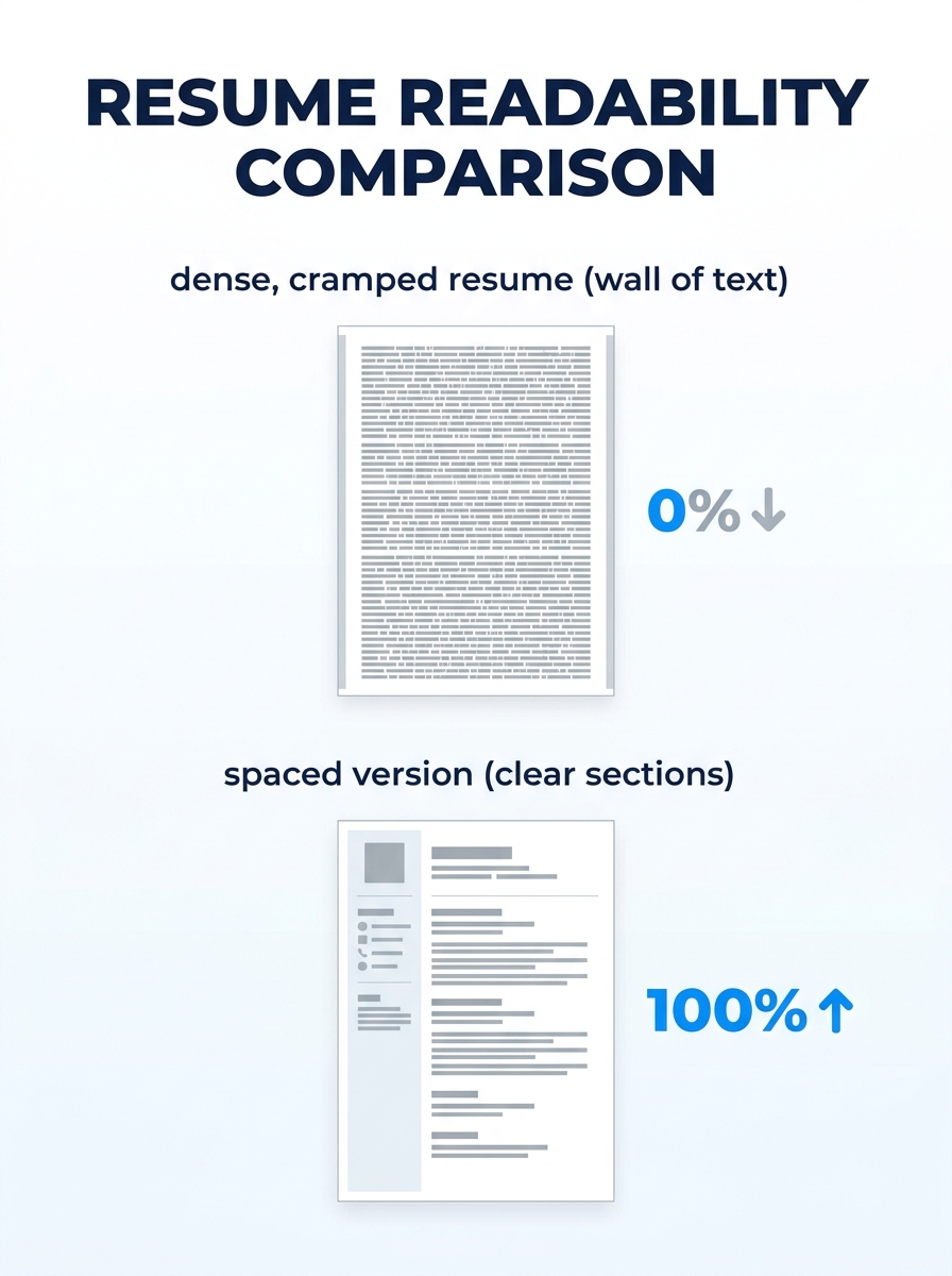
Print three resumes and tape them to a wall across the room. The first fills every square centimeter with 9-point Garamond, margins shaved to 0.3 inches, bullet points stacked eight deep under each role. The second uses 0.75-inch margins, clean section breaks, and five bullet points per position with visible breathing room between each block of text. The third has a grand total of twelve lines on the page, surrounded by so much empty space it looks like a poem.
From ten feet away, you already know which one you’d pick up first. That gut reaction is the entire thesis of resume white space formatting, and it’s backed by real data: research from Washington University’s Center for Career Engagement found that properly spaced text can increase reader comprehension by up to 20%. The hiring manager scanning your resume at 7.4 seconds isn’t making a reading decision. They’re making a visual one.
Three formatting philosophies compete for your attention when you sit down to build a one-page resume layout. Each one has defenders. Each one has tradeoffs. And only one consistently survives the scan-to-interview pipeline.
The Dense Resume That Tries to Say Everything
The instinct behind a packed resume is understandable. You’ve worked hard, accumulated real accomplishments, and leaving any of them off the page feels like leaving money on the table. So you shrink the font to 9 or 9.5, push margins down to 0.3 inches on each side, eliminate spacing between sections, and stack seven or eight bullets under every job title.
The result is a document that technically contains more information but practically communicates less of it.
Here’s why. When a recruiter opens your resume, their eyes need anchor points. Section headings, bold job titles, clear gaps between roles. A dense resume removes those anchors. Every line looks the same as the line above it. The eye skips, bounces, and eventually settles on whichever cluster of words happens to catch first. That’s random selection, and random selection means your strongest achievement might never get read.
There’s also a mechanical problem. ATS platforms that now evaluate spatial relationships and visual hierarchy on resumes can flag documents with margins below 0.5 inches as improperly formatted. If your margins are too tight, some systems clip text along the edges during parsing. You wrote those bullet points for nothing.
The dense approach does have one narrow use case: federal resumes. Government applications often expect multi-page documents with exhaustive detail, and the evaluation criteria reward thoroughness over scannability. If you’re applying to a GS-13 position through USAJOBS, density is expected. For every other context, it works against you.
When People Choose Dense Layouts
Candidates with 15+ years of experience gravitate here because they genuinely have too much to fit. Career changers with diverse backgrounds do the same. The solution in both cases isn’t cramming. It’s editing. Cut the bottom 20% of your least impactful bullets. If you held a role eight years ago and the responsibilities don’t relate to the job you want now, reduce it to a single line with title, company, and dates. The content you remove makes the content you keep more powerful, and that principle is at the heart of replacing weak resume language with action-driven results.
A Balanced Layout Wins the 7-Second Scan
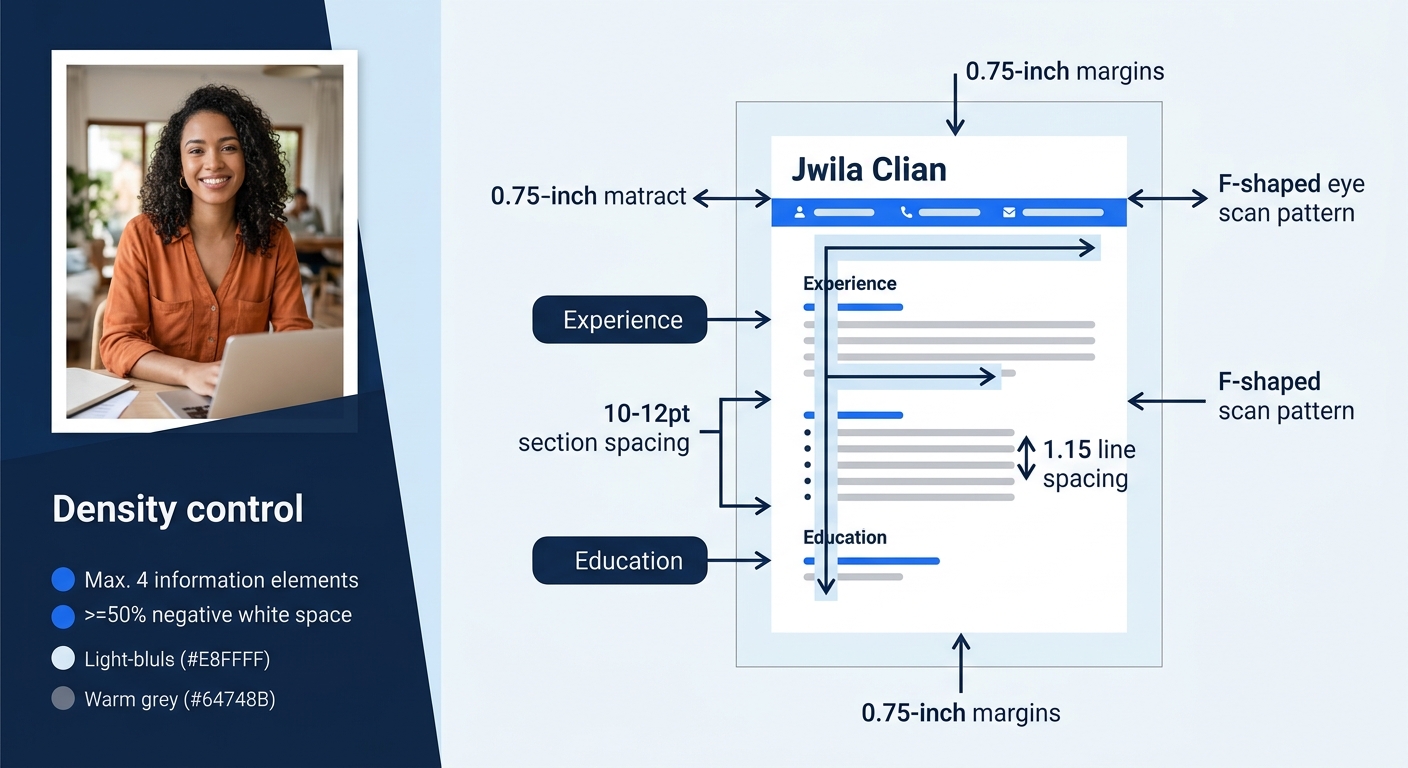
The balanced approach treats white space as a design element with a specific job: directing the reader’s eyes to the information that matters most. Margins sit at 0.75 to 1 inch on all sides. Line spacing runs between 1.15 and 1.3. Section breaks use 8 to 12 points of additional space. Bullet points stay at one line each, two at most.
This is where resume readability optimization gets practical. The visual hierarchy on a balanced resume works like this: your name is the largest element (14 to 16 points). Section headings come next (11 to 12 points, bold). Job titles and company names follow (10 to 11 points, bold or italic). Body text and bullet points sit at 10 to 11 points, regular weight. According to a visual hierarchy guide from CareerBldr, this principle determines what the reader sees first, second, and third.
White space doesn’t represent missing content. It represents a decision about what deserves attention.
The 7.4-second initial scan follows an F-shaped pattern. The reader’s eyes move horizontally across the top of the page (your name, contact info, maybe a summary), then drop down the left side, catching section headers and the first few words of each bullet point. A balanced layout puts clear white space between each of those horizontal passes. The eye drops, lands on a new section header, and reads right. Without those gaps, the F-pattern collapses into a blur.
Here’s the specific setup that works for most candidates targeting a one-page resume layout:
- Margins: 0.75 inches on all four sides (0.5 inches is the absolute minimum; anything less risks ATS clipping)
- Line spacing: 1.15 within bullet points and body text
- Section spacing: 10 to 12 points after each major section (Experience, Education, Skills)
- Bullet points per role: 3 to 5, each fitting on a single line
- Font size: 10 to 11 points for body, 14 to 16 for your name
- Alignment: Left-aligned throughout (justified text creates uneven word spacing that disrupts reading flow)
These resume design best practices aren’t arbitrary aesthetic preferences. They directly affect whether your resume survives the increasingly sophisticated ATS screening processes that now evaluate document structure alongside keywords.
The “Arm’s Length” Test
Print your resume or view it at 50% zoom on your monitor. If you see solid gray rectangles of text with no white channels running between them, you have a density problem. You should see clear lanes of white between sections, and individual bullets should look like discrete lines rather than a continuous paragraph. This takes about five seconds and catches spacing issues that are invisible at full zoom.
Tip: If you’re using Microsoft Word, you can adjust paragraph spacing in the “Paragraph” dialog box under “Spacing After.” Set it to 6pt for subtle breaks between bullets and 10-12pt for section breaks. Google Docs has similar controls under Format > Line & paragraph spacing.
The Minimalist Resume With Too Much Air
The opposite extreme is a resume with vast stretches of empty page. Early-career candidates sometimes land here because they genuinely have limited experience to include. And some design-focused applicants do it intentionally, treating their resume like a gallery exhibition where each bullet point is a piece of art that needs two inches of surrounding wall.
The problems are different from the dense resume but equally damaging. A hiring manager who sees half a page of content surrounded by white space doesn’t think “elegant.” They think “thin.” If you’re applying for a mid-level or senior role and your resume looks like it belongs to someone six months out of college, the visual impression undermines your candidacy before a single word gets read.
There’s also a practical concern: if your resume spills onto a second page but the second page is only 30% full, you’ve created what recruiters call a “dangling page.” This signals either poor editing skills or insufficient experience for a two-page format. The signs your resume isn’t getting results often trace back to structural decisions like this one.
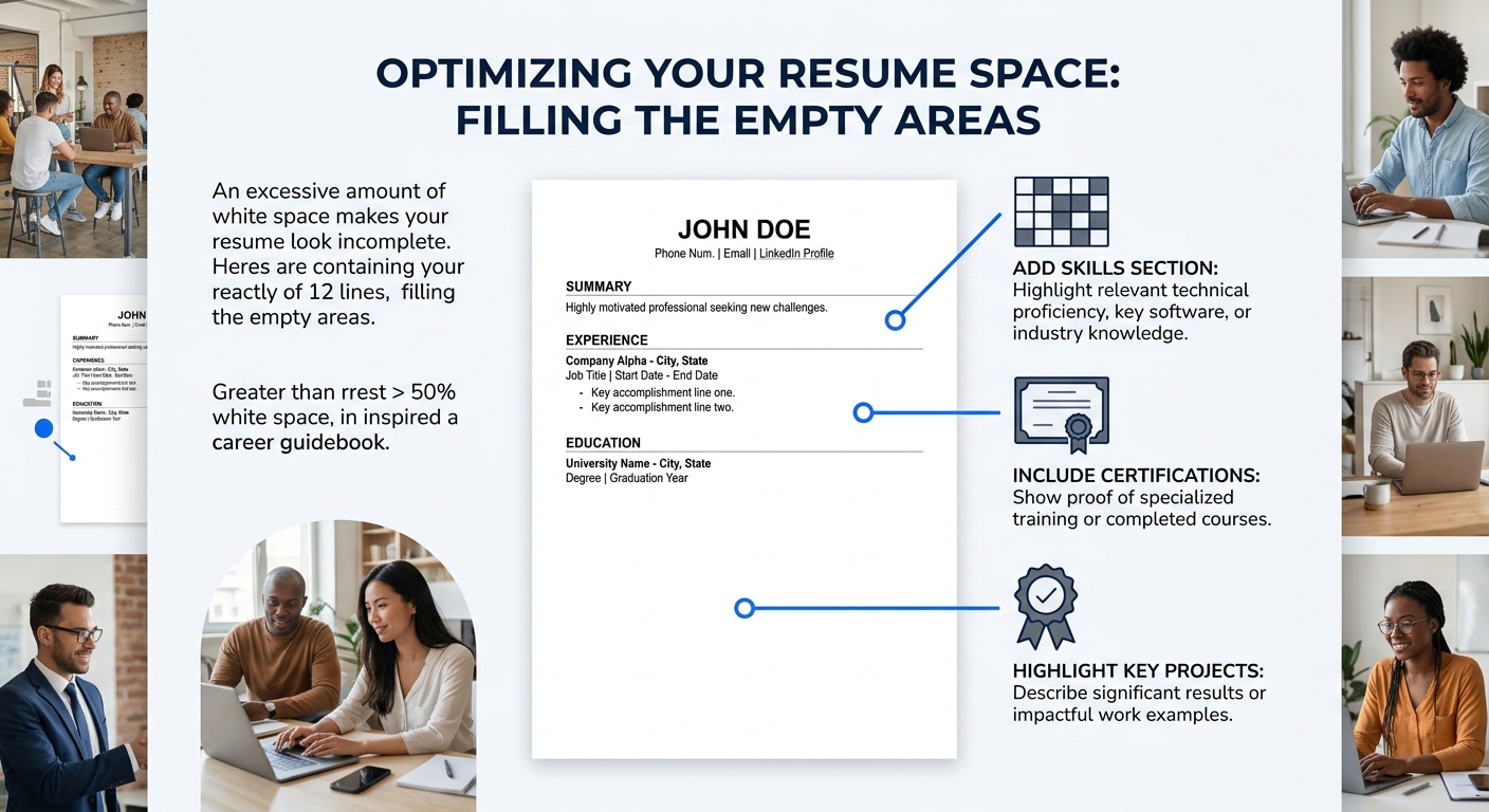
How to Fill Space Without Padding
If your resume looks empty, the answer is adding substance rather than inflating what’s already there. Consider including a Skills section with specific tools and platforms. Add relevant coursework, certifications, or professional development. Volunteer work and leadership roles count. If you’ve completed substantial projects (academic or personal), those deserve a section. The goal is occupying roughly 70-85% of the page with content, leaving 15-30% as intentional white space distributed evenly across sections. We’ve covered additional resume sections worth including even when job postings don’t explicitly ask for them.
How To Choose Between These Three
The balanced layout is the right answer for roughly 85% of job seekers, and I’ll say that directly rather than pretending this is a close call. Research consistently shows that resumes with strategic white space get read more thoroughly, parsed more accurately by ATS platforms, and rated higher by human reviewers.
But the honest answer includes two caveats.
If you’re in a creative field (graphic design, UX, art direction, marketing), you have more latitude to push toward minimalism as long as content density stays adequate. Your resume is a design sample, and showing restraint signals taste. Keep it above 60% content coverage, and make sure the white space itself looks intentional rather than accidental.
If you’re applying to government or academic positions, density is expected and sometimes required. Federal resumes routinely run three to five pages. Academic CVs include every publication, presentation, and grant. In these contexts, a one-page layout with generous spacing would look like you’re hiding a thin record.
For everyone else, the formula is straightforward: 0.75-inch margins, 1.15 line spacing, 3-5 bullets per role, consistent section spacing, and a single page. When hiring managers scan your resume in those first few seconds, they’re responding to the overall shape of the document before they read a single word. A balanced layout makes that shape work in your favor. A cramped one makes them squint. An empty one makes them wonder.
The resume that gets read isn’t the one with the most information. It’s the one where the right information is easy to find. White space is what makes finding it possible.