
The design-heavy resume template you downloaded is the single biggest reason your applications disappear into automated rejection queues. Between 75% and 88% of resumes are filtered out by ATS software before any human reads them, and formatting drives the majority of those rejections. Resume formatting best practices 2026 have shifted decisively toward simplicity.
TL;DR: ATS systems read resumes linearly, left-to-right, top-to-bottom. Multi-column layouts, text boxes, and decorative graphics cause parsers to scramble your content into unreadable fragments. A clean single-column format with consistent spacing and clear section headers is the single highest-impact formatting change most applicants can make.
The standard advice tells you to pick a beautiful template, add some color, make it “stand out.” That guidance is backwards. Recruiters in the United States spend fewer than 10 seconds on an initial resume scan, according to formatting research from CVOwl. Within that window, they’re judging structure, not aesthetics. And before they even get the chance, your resume has to survive an algorithmic gatekeeper that treats creative formatting as noise. The visual parsing reality is blunt: 72% of recruiters reject candidates based on poor formatting alone, and 62% of hiring managers say overly designed resumes with excessive colors or graphics actively hurt their perception of the applicant.
This article defends a specific claim: formatting failures destroy more applications than weak experience does, and three specific formatting problems account for the vast majority of those losses.
ATS Parsers Read Linearly, and Your Two-Column Layout Breaks Them
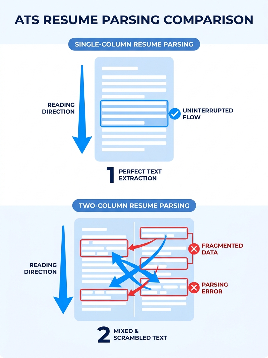
ATS software processes resume text in a single stream, reading left-to-right, top-to-bottom. When a resume uses a two-column layout, tables, or text boxes, the parser slices horizontally through both columns at once, mixing unrelated data into what recruiters describe as “word salad.” Your job title from the left column gets concatenated with a skill keyword from the right column. The result is gibberish that no matching algorithm can score.
A Microsoft Word Blog analysis of resume formats confirmed that clean, well-organized single-column formats significantly improve the chances of passing ATS screening because systems can scan and interpret content accurately. This finding matters because 90% of recruiters prefer the reverse-chronological format for its straightforward linear structure, and ATS systems are calibrated for exactly that layout.
The damage extends beyond parsing errors. When an ATS can’t extract your section headers correctly, it may categorize your entire work history as a single block of unstructured text. Your resume readability structure collapses. Keywords that should map to specific fields (job title, employer name, dates) get dumped into a generic “other” category, which means even if the right keywords exist on the page, the system can’t match them to the right database fields.
If you’ve been optimizing your resume for ATS and human readers, the formatting layer is where that optimization either holds together or falls apart. The content can be perfect. If the container breaks the parser, no one reads the content.
Save as .docx or a text-based PDF. Avoid image-based PDFs and templates from design platforms that embed text inside graphics. Standard fonts (Arial, Calibri, Garamond) at 10 to 12pt ensure consistent rendering across systems. These aren’t style preferences. They’re compatibility requirements that determine whether your resume enters the readable pile or gets auto-rejected.
Eye-Tracking Data Reveals the F-Pattern, and Your Visual Hierarchy Fights It
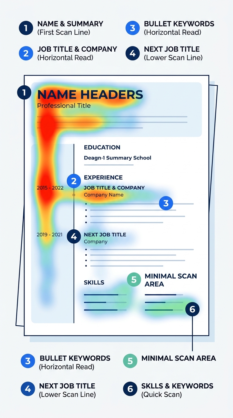
Why do recruiters spend an average of 6 to 7 seconds on an initial scan? Because they’re not reading. They’re pattern-matching. Eye-tracking research from Wonsulting documents that recruiters follow an F-shaped scanning pattern: “they scan across the top line, then down the left margin and across part of the next line before moving further down,” according to Wonsulting’s eye-tracker analysis. The Nielsen Norman Group has validated this F-pattern across web content broadly, and the ResumeHeatMap 2026 eye-tracking study identified six specific fixation points recruiters hit: name, current title, current company, employment dates, previous role, and education.
That’s your visual resume hierarchy in practice. The top-left quadrant of your resume receives disproportionate attention. Your name, current title, and most recent employer need to live there, rendered in the largest and most prominent type on the page. A MarketingProfs-published eye-tracking study measured this behavior directly and found that “recruiters tend to follow a consistent visual path when reviewing both resumes and online profiles.” On a 1-to-7 scale, professionally formatted resumes scored measurably higher than unformatted ones.
Recruiter scanning patterns are predictable, which means you can design for them. The top third of your resume carries roughly 44% of the visual weight during a scan. Place your professional summary, most recent role, and 2 to 3 headline achievements there. Bury those elements in the bottom half, and the 6-to-7-second scan ends before the recruiter reaches them.
Understanding how recruiters actually process what they see connects directly to how screening decisions get made in the first 30 seconds. The formatting is information architecture, and the architecture either guides the recruiter’s eye to your strongest qualifications or scatters their attention across a disorganized page.
What Fights the F-Pattern
Centered text forces the eye to hunt for the left margin on every line. Decorative sidebar graphics pull attention away from the content column. Dense paragraphs of narrative text (instead of bullet points) blur together during a rapid scan. Each of these common design choices directly contradicts the way recruiters physically move their eyes. According to screening data, 34% of recruiters view a lack of result-oriented statements as a dealbreaker, and those statements need to be formatted as scannable bullets to register during the F-pattern sweep. If you’re working on converting vague duties into measurable outcomes, make sure those improved bullets are structurally visible, not buried inside paragraphs.
Resume White Space Optimization Separates Readable Documents From Visual Noise
The 2026 trend data is unambiguous: generous white space, consistent typography, and a clear visual hierarchy define the resume formatting standard that recruiters prefer. Resume white space optimization isn’t about making your document look sparse. It’s about grouping related information so the human brain can process it in chunks.
Research from Resume.AI explains the cognitive mechanism behind this: “The human brain processes information in groups, so these spacing choices actually help hiring managers remember your qualifications better.” The specific recommendation is to add more space before each company/title entry than between the bullet points under it. This creates clear visual boundaries between roles while keeping the details within each role tightly associated.
Here’s what the spacing hierarchy looks like in practice:
| Spacing Element | Recommended Size | Purpose |
|---|---|---|
| Top margin | 0.5 to 0.75 inches | Prevents header clipping by ATS parsers |
| Between major sections (Experience, Education) | 12 to 16 points | Signals a new content group |
| Between job entries within a section | 8 to 10 points | Separates roles without fragmenting the section |
| Between bullet points | 2 to 4 points | Keeps achievements visually grouped under their role |
| Line spacing within text | 1.0 to 1.15 | Readable without wasting vertical real estate |
| Side margins | 0.5 to 1.0 inches | Provides breathing room for the eye |
This table reflects the resume formatting best practices 2026 that both ATS systems and human reviewers respond well to. Hireflow’s spacing analysis found the best resume spacing works for both audiences simultaneously: ATS systems need clear section boundaries and consistent formatting to parse information accurately, while recruiters need visual hierarchy and whitespace to scan qualifications quickly.
If you’re building your first resume inside a beginner assembly framework, get the spacing right before you worry about word choice. And if you’re concerned about fitting enough content, the solution is understanding when depth matters more than page count, not cramming text into every available pixel of margin space.
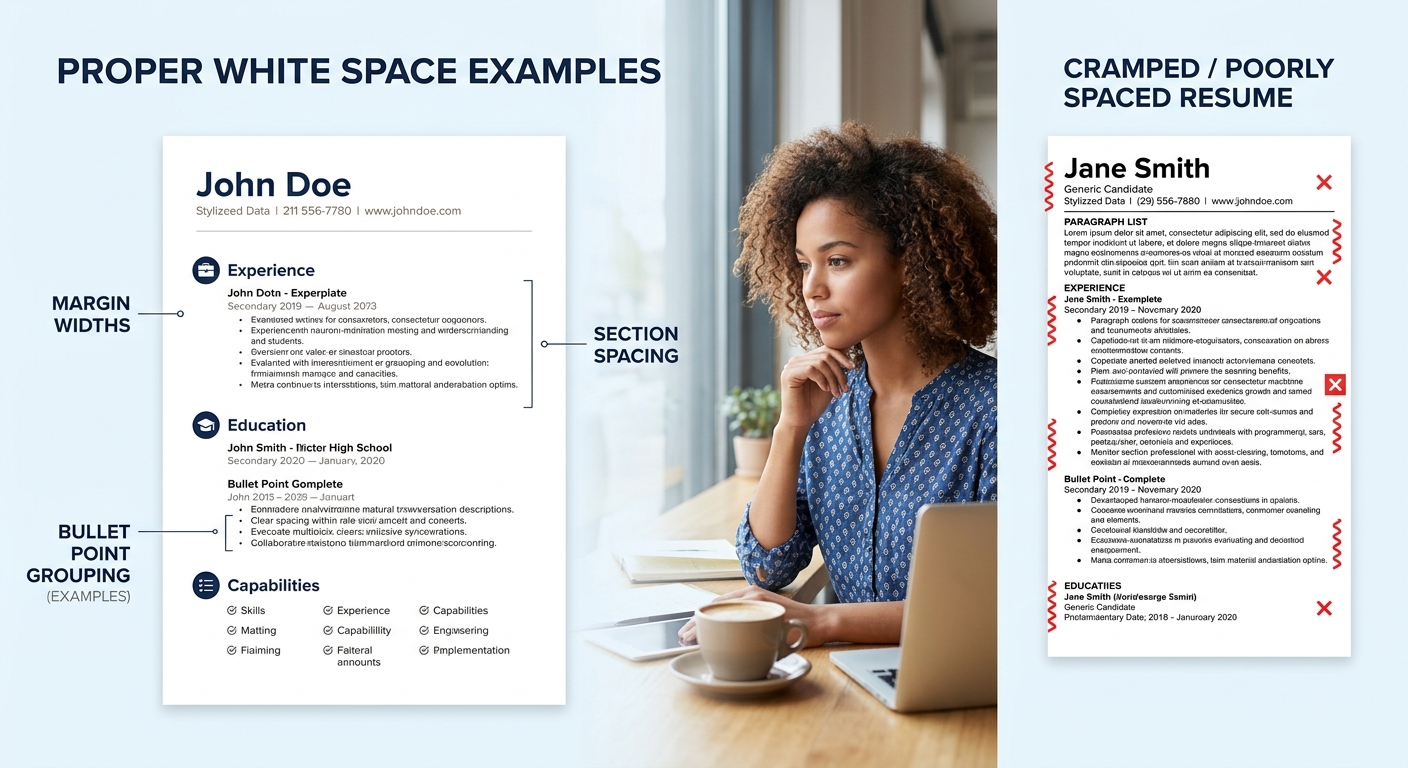
Generous white space doesn’t waste space on your resume. It tells the recruiter’s brain where one idea ends and the next begins.
The One-Color Rule
Color can work on a resume, but the threshold for “too much” is far lower than you’d expect. The 2026 palette, according to Resume Optimizer Pro, limits color to one accent applied only to the name, section headers, or a single horizontal rule. Navy, slate, deep teal, and muted burgundy are the safe choices. Body text stays black on white so ATS parsers never attempt to read color-on-color combinations, which some older systems interpret as blank space. Multiple colors, red or yellow accents, and colored backgrounds all fall into the category of formatting chaos that triggers the 62% negative-perception rate from hiring managers. Stick with one. Let the white space and typography do the visual work.
The Claim, Revisited
The argument here is specific: formatting failures cause more application rejections than weak qualifications. The evidence lines up across three dimensions. ATS parsers reject 75% to 88% of resumes before human review, and layout complexity is the primary trigger. Eye-tracking research proves recruiters follow a predictable F-pattern that poorly structured resumes violate on every line. And cognitive spacing research demonstrates that resume white space optimization directly affects how well hiring managers retain your information after a 6-to-7-second scan.
None of this diminishes the importance of content. Your action verbs, quantified achievements, and keyword alignment still carry the substance of your candidacy. But that substance has to survive two filters (automated parsing and a rapid visual scan) before anyone evaluates it. A single-column layout, an F-pattern-aligned visual resume hierarchy, proper section spacing, and one-color restraint form the structural foundation that gets your content through both filters intact.
The recruiter scanning patterns documented across multiple eye-tracking studies are remarkably consistent. They won’t change because your template looks impressive on a design portfolio. So the formatting question was never really about standing out from other applicants. It was about making sure the systems and the humans who control your candidacy can actually read what you wrote.