
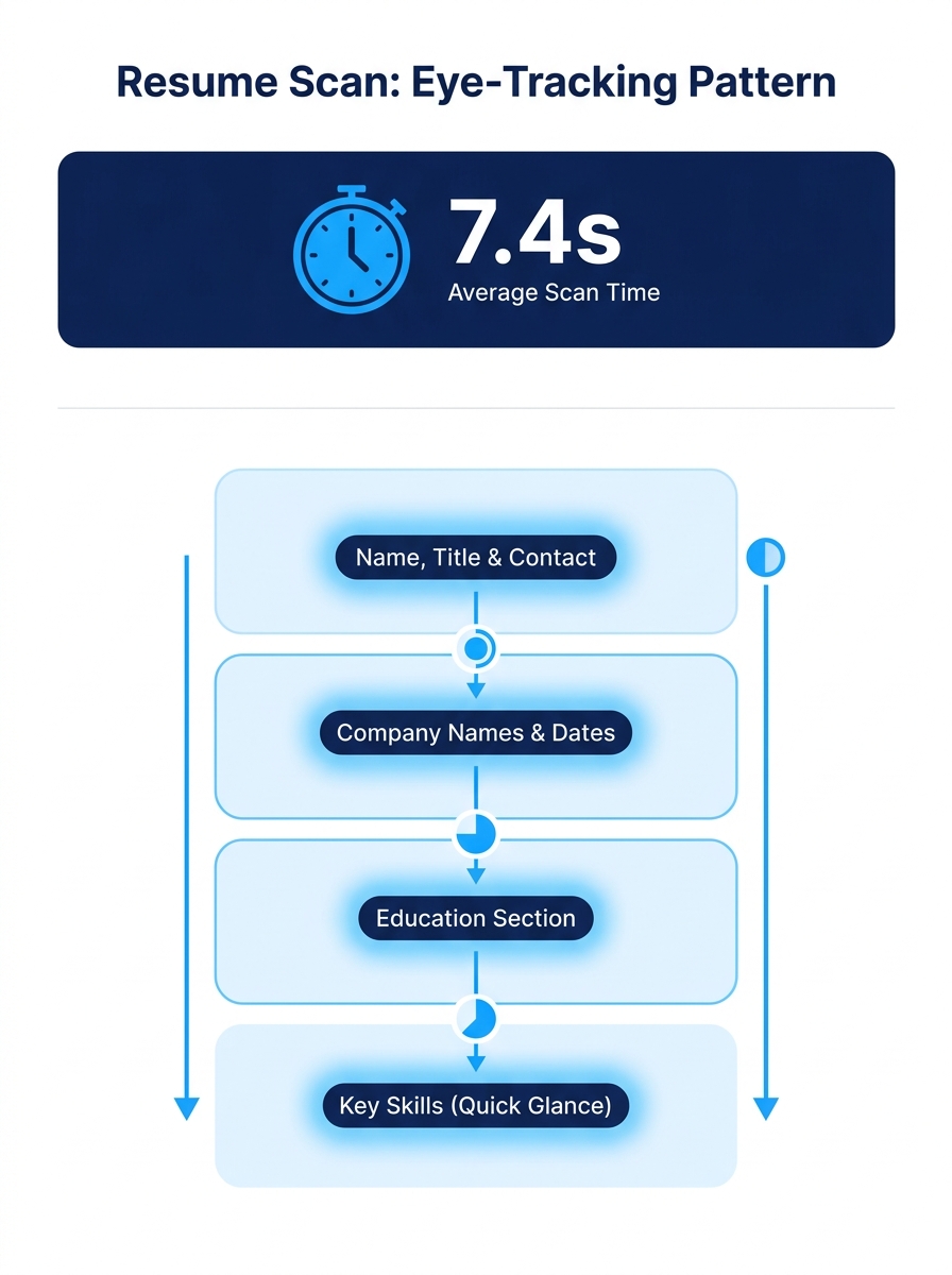
TheLadders’ eye-tracking study tracked exactly where recruiters look during a resume scan: the average was 7.4 seconds, following a fixed visual path across name, current title, company, dates, and education. Understanding that path changes how you build your resume’s top third.
TL;DR: Recruiters spend an average of 7.4 seconds on an initial resume scan, following a predictable visual pattern. Six rules govern how to survive that window: lead with a legible layout, mirror the job title in your header, quantify achievements above the fold, kill decorative clutter, clear the ATS gate before the human gate, and write your summary like a billboard headline. With 71% of companies running ATS filters and 37% of applications screened out before a human looks, every structural choice in your top section counts.
The six rules below are drawn from recruiter workflow data, eye-tracking research, and how hiring decisions actually get made inside organizations. Each one includes the situations where the rule holds firm and the rare moments when it bends.
Lead with layout, not with content
The eye-tracking data showed that resumes with simple layouts and clear section headings held recruiter attention measurably longer than those with complex designs. According to Morgan Hunter’s resume analysis, the best-performing resumes stick to one font, use bullet points consistently, and make deliberate use of white space.
Why does layout beat content in the first few seconds? Because recruiter resume screening is a pattern-matching exercise, not a reading exercise. When a recruiter faces 10,000+ resumes across multiple open roles, the brain switches into scan mode. A cluttered layout forces the eye to hunt for basic information, and the recruiter moves on before finding it.
Stick to a single-column format for the top half of page one. Use a standard sans-serif font (Arial, Calibri, Helvetica) at 10.5-11pt. Make your section headers bold and left-aligned. The visual hierarchy should be obvious at arm’s length: name, title, contact info, summary, experience.
When this rule bends: Creative roles (graphic design, UX, brand strategy) sometimes benefit from a designed resume that doubles as a portfolio sample. But even then, 62% of hiring managers penalize overly designed resumes, according to recruiter survey data. If your design creates friction during a 7.4-second scan, it’s working against you.
Mirror the exact job title in your top section
The recruiter’s first eye fixation lands on your current title and company name. If you’re applying for a “Senior Product Manager” role and your resume header says “Strategic Operations Leader,” you’ve already introduced friction into a 7-second window.
This is the core of resume top section strategy: the title on your resume should match, as closely as honest representation allows, the title in the job description. Recruiters are scanning for fit signals, and the title is the single biggest fit signal above the fold. TechieCV’s breakdown of how recruiters screen resumes confirms that the initial filter exists to “quickly sort through hundreds of resumes and filter out the ones that aren’t an obvious fit.”
If your actual title was different, put the functional equivalent in parentheses or adjust your summary to bridge the gap. For example: “Operations Manager (Product Management focus)” or a summary line that reads “Product management leader currently titled Operations Manager at [Company].”
This pairs well with the process of reverse-engineering a job description into a targeted resume, where you pull specific title language and priority qualifications directly from the posting.
When this rule bends: When your real title is more senior or more recognized than the one in the posting. “VP of Engineering” applying for a “Director of Engineering” role doesn’t need to downgrade. The seniority signal helps.
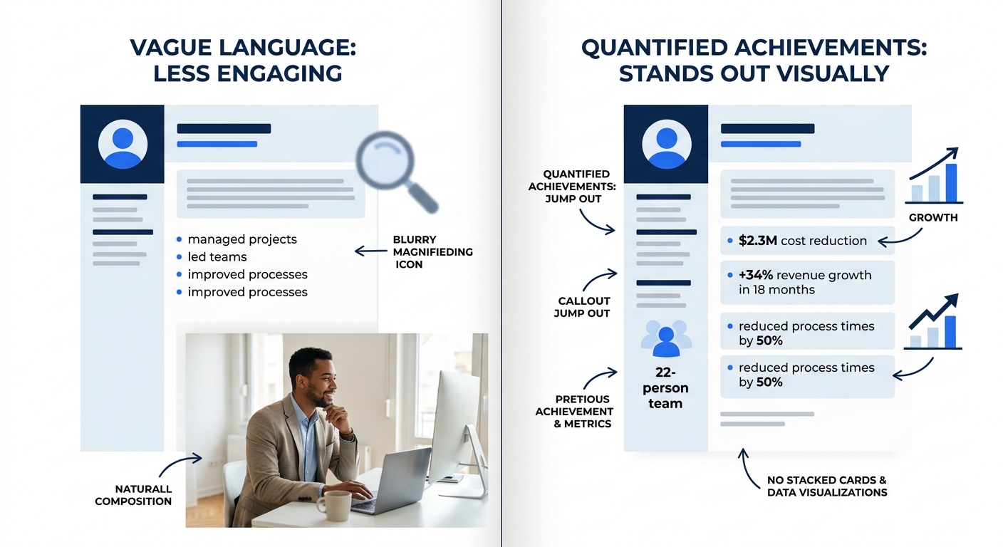
Quantify your biggest achievement above the fold
The fundamental sections for a strong resume first impression are summary, skills, education, and experience, each written in a results-driven format. “Results-driven” means numbers. Percentages, dollar figures, headcounts, timelines, efficiency gains.
Your single most impressive quantified achievement belongs in your summary or in the first bullet of your most recent role. That’s the zone the recruiter’s eye hits during the 7.4-second scan. Burying a “$2.3M cost reduction” in bullet seven of your third job is the same as not including it at all.
Here’s the hierarchy for which numbers recruiters care about most:
- Revenue generated or saved (“Grew regional sales pipeline by $4.1M over 18 months”)
- Scale managed (“Led cross-functional team of 22 across 3 time zones”)
- Speed or efficiency (“Reduced onboarding cycle from 6 weeks to 9 days”)
- Quality or satisfaction (“Achieved 97% client retention rate across 140 accounts”)
If you’re struggling to quantify your work, especially in non-technical roles, the resume metrics framework for non-technical roles walks through the specific math behind translating qualitative contributions into concrete numbers.
When this rule bends: Entry-level candidates with limited professional metrics can substitute academic honors, project scope, or volunteer outcomes. The point is specificity, not necessarily corporate metrics.
Tip: If you can’t name a dollar figure, name a count. “Managed inventory for 3 retail locations” is weaker than “Managed $1.2M inventory across 3 locations,” but both beat “Managed inventory across multiple locations.” Specificity is what the recruiter’s brain latches onto during a scan.
Strip every decorative element that doesn’t earn its space
Graphics, icons, sidebars, headshot photos, colored bars, and skill-rating charts all consume visual real estate without communicating the information recruiters are scanning for. And 72% of hiring managers say inconsistent formatting is a negative signal.
Think of your resume as a one-page data sheet, not a marketing brochure. Every element should answer one of these questions: What is your title? Where have you worked? What did you accomplish? What skills do you have? If a design element doesn’t answer any of those, it’s taking up space that a quantified bullet point could occupy.
Skill-rating bars (the ones that show “Python: 4/5 stars”) are a particular problem. They communicate zero useful information. What does 4 out of 5 stars in Python mean? Recruiters don’t know, and they don’t try to figure it out. Replace those bars with a flat skills list organized by proficiency level or by relevance to the target role.
If you’re evaluating whether your current resume builder is helping or hurting, top resume builders tend to offer clean, ATS-compatible templates alongside flashier options. Choose the boring template.
When this rule bends: A tasteful accent color (a single dark blue or charcoal instead of pure black) for section headers can improve visual hierarchy without adding noise. One color. One purpose. Nothing decorative.
Write for the ATS gate before the human gate
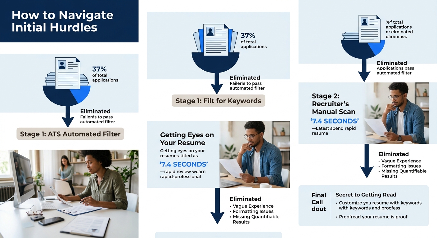
Here’s the hiring process inside view that most candidates miss: the recruiter’s 7.4-second scan is actually the second filter. The first filter is automated. Approximately 71% of companies now use applicant tracking systems that filter candidates based on keyword matches, and 37% of applications are screened out by ATS before a human ever sees them, according to current hiring data.
Companies like K&N and Applebee’s use automated processes for hourly hiring but switch to manual screening for management and headquarters roles, as documented by Eddy’s HR research. So the stakes vary by role level, but the ATS pass is usually required regardless.
What does this mean practically? Your resume needs exact keyword matches from the job description. If the posting says “project management,” don’t substitute “program oversight.” If it says “Salesforce,” don’t write “CRM platform.” The ATS is matching strings, not interpreting synonyms.
For a deeper look at why formatting matters for machine readability, the ATS-proof resume format audit covers the specific layout failures that cause parsing errors, from multi-column designs to headers embedded in text boxes.
And here’s the tension: 37% of qualified candidates get filtered out because their resumes aren’t ATS-friendly. Business.com’s screening research notes that employers “may lose out on highly qualified candidates who are screened out of hiring processes by ATS systems because they aren’t submitting ATS-friendly resumes.” Some employers are starting to periodically review low-scoring applications to check whether their filters are too aggressive.
The recruiter’s 7.4-second scan is actually the second filter. The first is automated, and 37% of applications never survive it.
When this rule bends: For roles sourced through direct referral or recruiter outreach, your resume often skips the ATS entirely and goes straight to a hiring manager’s inbox. In those cases, optimizing for human readability matters more. If you’re working the referral and outreach ecosystem behind most filled roles, format for the person, not the parser.
Treat your summary like a billboard at highway speed
A recruiter moving through hundreds of resumes is functionally driving past your resume at 65 mph. Your professional summary is the billboard. It gets maybe 2-3 seconds of the total 7.4. If the recruiter can’t extract your role level, your industry, and your strongest qualifier in that window, the summary failed.
Write 2-3 lines. Front-load the noun phrase that matches the job title. Include one quantified achievement. Name your industry or domain. That’s it.
Bad summary: “Dynamic and motivated professional with a passion for excellence and a proven track record of delivering results in fast-paced environments seeking new opportunities to grow and contribute.”
Good summary: “Senior Product Manager with 8 years in B2B SaaS. Led 3 product launches generating $6.2M ARR. Specializes in platform migration and enterprise onboarding.”
The bad version contains zero searchable information. The good version answers who, how long, what kind of work, and what scale. Every word is doing a job.
And remember that this summary also needs to clear the ATS keyword filter discussed above. If the job description emphasizes “stakeholder management” and “agile methodology,” those phrases belong in your summary if they’re true.
Warning: Recruiter decision making happens at the intersection of ATS filtering and human scanning. Your summary is the one section that must satisfy both. A keyword-stuffed summary that reads like gibberish will pass the ATS and fail the human. A beautifully written summary missing critical keywords will fail the ATS and never reach the human.
If you’ve been optimizing your resume for the human who reads it second, you already know this balance well. The summary is where getting it right matters most.
When These Rules Conflict
These six rules work together most of the time, but they occasionally pull in opposite directions. Mirroring a job title exactly might mean using a keyword the ATS loves but that undersells your actual seniority to a human reader. Stripping decorative elements for ATS compatibility might produce a resume so plain that it fails to hold a human recruiter’s attention during competitive screening for creative roles.
When the rules conflict, default to this priority order: ATS compatibility first (because it’s a binary gate), layout clarity second (because it controls where the eye goes), title and keyword match third (because it determines whether the recruiter keeps reading), and quantified achievements fourth (because they’re what convert a scan into a “yes” pile placement).
The recruiter who reviews your resume doesn’t make the final hiring decision. As Indeed’s career research notes, “a recruiter searches for qualified candidates and encourages them to apply for the position. They may influence who receives an offer for the role, but they don’t make the final decision.” The hiring manager does. But the recruiter controls whether you reach that hiring manager at all, and the window for earning their attention is 7.4 seconds long. These six rules are built around making those seconds count.